How to make your photos look like film
Home »
03.03.2016
In this post I show you how I make my digital images look like they were shot on modern 35mm film. It is one of my most popular blog posts and was most recently updated in May 2019.
In case you want the TL;DR version of events here’s how I do it, largely in camera:
ETTR to minimise digital noise and achieve the correct shadows exposure in camera; use vintage or legacy lenses; boost the luminance in the midtones in post-production; use film presets to mimic the colours of 35mm film stock. Remember though, the most important thing is your base file. No amount of post-production can turn a bad photo into a good one.
If you want to know more of the hows and whys, as well as my suggestions for good quality film emulation presets, read on.
What is the ‘film look’?
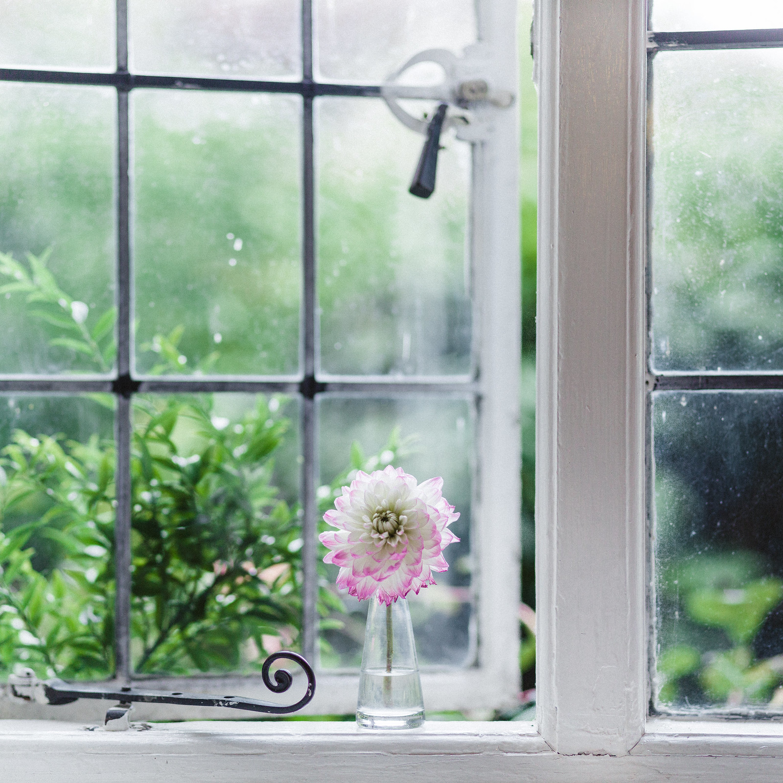
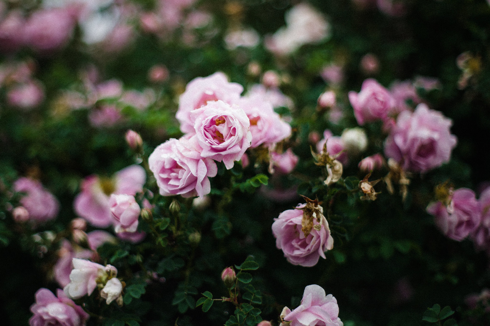
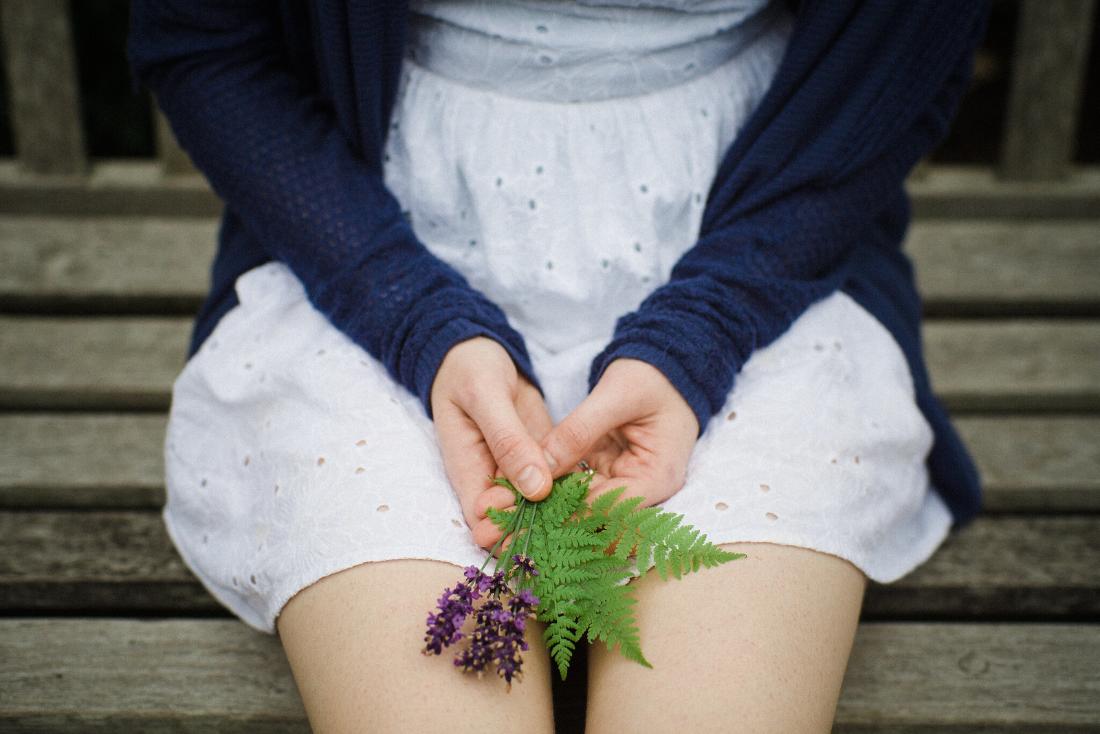
To different people ‘the film look’ means different things, probably as a result of the many types of film stock which have been in production over the years. Modern professional colour films designed for portraiture such as Kodak Portra 160 or 400, Fuji Pro 400H or Ilford Delta 100 render a very different image to early colour films. When I’m looking to reproduce a ‘film look’ on digital I’m seeking to make my images appear bright with soft, natural colours, a boost in luminance in the midtones and normal contrast. It’s the aesthetic I find most pleasing, and how I see the world when I’m looking through my viewfinder. Others may be looking to emulate the look of faded film prints with yellow tints and washed out colours, whilst some photographers love a high contrast, high grain black and white image, particularly for street photography.
Why shoot or emulate film in 2019?
The world has largely shifted to digital but the allure of film is hard to shake, and there are hundreds if not thousands of apps, filters, presets and tutorials out there showing you how to fake it in post-production. In this post I’m focusing less on the editing, and more on how to make your photos look good first time, in camera. I’ve seen it done with an entry-level DSLR and a budget 50mm F1.8 lens though. You do not need to spend money on equipment, you just need to know the technique.
Film purists would stop right here and say “if you want your photos to look like film, then shoot film!” … which is all well and good except that film is quite expensive, requires developing, and can be intimidating for those starting out in photography.
Digital cameras have their advantages and allow us to achieve a level of technical perfection which was nearly impossible in the film era, but film has qualities which, in my subjective opinion, digital sometimes struggles to fully match. That’s not to say that digital is inferior; it’s much more practical and an easier format to learn, but without some manipulation it can lack the warmth, texture and dynamic range (ability to accurately capture very bright and very dark areas in the same frame) of film. To me, film photographs look almost three dimensional and exert a powerful emotional pull, which is something I’m constantly striving for in all aspects of my photography. When I’m shooting on digital, I use the tips I outline below so that I can get my images to look as film-like and magical as possible.
How to make your digital photos look like film
Creating a strong digital negative
What makes film so lovely as a photographic medium is the way it reacts to light. It is different to the way a digital sensor reacts to light as it is non-linear. Film and digital are different mediums and one can never be the other, however, there are things you can do in camera which will mean that you have a strong file, or ‘negative’ to work with as a starting point when emulating film with digital. With digital photography, your negative is actually a positive in the form of your RAW file. I find that I’m happiest with my digital images when they’re ever so slightly over-exposed by 2/3 to 1 full stop in camera, but I take care when doing this not to clip the highlights. This means that I can minimise digital noise, get the best colours out of my digital sensor and have an easy time in post-production. It’s also easier to add digital grain to a clean, well exposed image than it is to a noisy image so if you like film grain, read on.
Good noise, bad noise and grain
A small note on the difference between digital noise and film grain. Feel free to skip this section if you care more for the ‘how’ than the ‘why’.
Grain is to film what noise is to digital, but with film it is largely in the luma channel only rather than both the luma and chroma channels. The luma channel contains brightness information about your picture, whilst the chroma channel describes its colours. In digital photography pixels are arranged on a sensor in various patterns of red, green and blue. When you crank up your ISO to take a picture in low light you may see noise creep in in the form of red, green and blue dots. It’s not pretty.
Though to some, noise is noise, a distinction can be made between the quality of film grain and digital noise. Monochrome film grain can add to an image by giving it texture, but digital noise isn’t quite so useful. Digital luma noise isn’t so bad (it can be thought of as ‘good noise’), but chroma noise in the form of unwanted red green and blue patches is just a distraction.
What film grain and digital noise have in common is that they are most apparent when you are taking photos in low light and need to use a higher sensitivity film, or a higher ISO setting on your digital camera.
Film grain is perceived as more desirable than digital noise because it’s analogue rather than electronic and as such it’s non-uniform in size and shape. As I’ve already mentioned, it also largely lacks colour detail. With film grain there’s no red, green or blue dots in the underexposed areas of photographs, though in seriously underexposed shots you may experience a frame-wide green or brown tinge with certain films. With film, the grain pattern can also be very fine, especially if you’re using a low sensitivity professional film. Digital noise is always the same size as pixels are uniform across a sensor. The human eye naturally picks up on patterns and colours, and so neat digital noise is much more noticeable than random film grain. In an underexposed area of a high ISO/ASA photograph, for example the shadows of an indoor portrait shot in low light, your eye is more likely to be drawn to the red, green and blue dots on the digital image than it would to the heavier grain on the same scene captured on film.
The good news is that you don’t have to put up with digital noise, and nor do you have to go out and buy an expensive top of the range camera. In 2018 I am still shooting with a Canon 5D2 and I also used this method to good effect with a Canon 60D. The trick is to minimise the chroma (colour) noise in camera and then add digital grain in post-production.
Step #1: ETTR (Expose To The Right) and use your ISO
Exposing To The Right is a technique used by film and digital photographers alike. The technique applies to low light photography but is good practice for daytime photography in strong light too.
The general principle is to expose correctly in camera so as to avoid or minimise digital chroma noise and keep as much detail in the shadows as possible. This allows you much greater flexibility in post when you edit the colours yourself, or use a film emulation preset. It goes without saying that if your camera allows it, you should be shooting RAW.
I would like to dispel a myth that you may have come across particularly if, like me, you’re self-taught: that you should avoid using the high ISO settings on your camera. This is simply not true. It’s correct that you should try and use the lowest possible ISO to get the exposure you need for your image, but by avoiding high ISO at all costs you are greatly limiting the potential of your digital camera.
Instead, try to avoid deliberately underexposing your image when shooting in low light or at high ISO. Unless you’re exposing for the highlights to create a silhouette, you really need to allow as much light to hit your sensor as possible.
If you are taking photos in low light then the first thing you should do is check your aperture and shutter speed settings. In full manual mode if you can’t go slower (due to camera shake and/or motion blur) or open up your aperture further (because you need the depth of field and/or are using a slow lens) then it’s time to turn to ISO. In this situation, it is almost always better to push your ISO up a setting and achieve the correct exposure in camera than limit your ISO for fear of noise. You can always pull the exposure down in post, but pushing up the exposure of an underexposed image isn’t going to work too well. Noise becomes apparent when there isn’t enough light, but even with an older DSLR you will be able to get a good image at high ISO so long as your ISO is high enough. Don’t be nervous about it, just push it. Remember, by pushing your exposure slightly beyond ‘normal’ exposure, you’ll end up with less chroma noise overall, even if the image looks slightly soft or grainy.
The ETTR technique is easiest to understand by looking at your histogram. On most cameras you can throw a histogram overlay across your image when you’re reviewing images in camera. On Canon cameras this overlay is activated by pressing the ‘info’ button in playback mode and cycling through a few different options. If you’re not sure how to get the histogram overlay to show on your camera either check in your manual or do a search online for ‘your camera model number’ + ‘histogram overlay’.
When exposing to the right you want to make sure that your histogram is as far to the right as possible without bunching up against the RHS. Just like you don’t want to lose detail in your shadows, you also don’t want to blow out (lose detail in) your highlights. By exposing to the right you are allowing more light into your camera which allows for better colour accuracy in your midtones and much more flexibility in post-production. At high ISO you’ll see less colour noise and if you want to bring the exposure back down in post to create a more dramatic image, you can do that without making your colours appear muddy.
Step #2: Add digital grain
If you have exposed your image correctly in camera and have low levels of chroma noise, you can now add some texture by applying a layer of digital grain. I use Lightroom to add grain and personally prefer a fine grain. If I choose to add grain, my Lightroom settings are usually amount : 40 ; size : 15 ; roughness : 5. You can also add grain in Photoshop, Gimp and many photo editing apps for mobile such as VSCO and Instagram. Adding grain is the last step in my editing process, after applying a film emulation preset, but that’s just personal preference.
Softness, vintage colours and a dreamlike feel
The secret : Legacy lenses aka ‘Vintage Glass’
I use Canon cameras for my digital work, and love that their EOS mount is compatible with so many legacy lenses including but not limited to lenses made for M42 and Olympus OM mount cameras. It’s the reason I chose Canon as my system in the first place; I wanted to be able to use my dad’s old M42 lenses, acquire new ones for next to nothing, and to get into photography without forking out a huge chunk of money for modern glass. They’re also great for video work as they’re designed for manual aperture and manual focus and are therefore easier to work with when adapted to a DSLR or mirrorless camera.
I love using legacy lenses. They have so many quirks from the colours and mood produced by their old glass coatings to imperfect lens designs and swirly bokeh patterns. They can also be prone to flare, slightly soft in certain places, and ‘glow’ creating a bit of a halo when wide open (e.g. the Olympus Zuiko 55mm F1.2). They wouldn’t win any awards based on lens test charts, but who in their right mind shoots lens test charts anyway! I’m an advocate of ‘sharp enough’ when it comes to lenses. Few people enjoy seeing their pores at 100% magnification, and a softer lens will glide over any skin imperfections.
Despite their faults by modern standards, there are some incredibly good, sharp and colour accurate lenses to be had too. One lens in my collection is the Carl Zeiss Jena 135mm F3.5 lens with an M42 mount. This was one of my dad’s lenses he’d had for years. It’s got punchy colours, good contrast and it is sharp across the frame.
Nikon cameras aren’t quite as flexible due to the distance between the sensor and the lens mount, but legacy lenses can be made to work on many different cameras such as Micro Four Thirds, Canon EOS, Sony E and Fuji X. All you need is your camera body, the lens and a suitable adapter. Adapters are available for full manual control, or with an electronic chip for focus confirm. You will of course need to focus manually, and physically turn the aperture ring on the lens rather than have the camera do it for you. It might not work quite so well for sports photography or lots of action, but if you’re taking pictures of landscapes, still life or even portraits in a casual setting, then you’ve got plenof time to slow down and focus manually.
Do check that there are no known issues with your camera body and the legacy lens you’ve got your eyes on. For example it’s known that certain copies of the Helios 58mm F2 don’t play well with full frame Canon cameras as they extend back into the body too far and can get in the way of the mirror. Of course this isn’t an issue with mirrorless cameras and APS-C DSLRs with smaller mirrors. I’ve found that the Helios 44M is mirror safe on the Canon 5D series though.
To experiment with legacy lenses, first find out which legacy lens mounts are compatible with your particular camera system by searching online and then take a look on Ebay, on Oxfam online, or at your local charity shop. If you have any family members who were into photography during the film days you may even find that they still have their cameras and lenses stashed away up in the loft. Just make sure to check that any lens you’re planning on buying is scratch and fungus free and that the focus ring turns.
A good starting point is any 50mm F1.8. They were often sold as kit lenses during the film camera era and can be picked up for next to nothing. I can recommend the Olympus Zuiko 50mm F1.8 as a cheap starter. It’s a tiny little thing with a lovely focus ring and the colours are great. I also enjoy the Pentacon 50mm F1.8 and the Helios 58mm F2 (my copy is a 44M).
Final touches
In this tutorial I’ve focused on what you can do in camera to make your photos look like they were shot on film. That said, there are a few tips I can share which relate to post-production.
Curves
Many people like to ‘crush the blacks’ to get a film look, but I personally think that the matte look is closer to a faded print than it is to modern film stock. I like a slightly different curve though which raises the midtones but leaves the shadows and highlights unchanged. I achieve this by gently pulling up and to the left on the histogram in Lightroom. Picture a compass, I would pull the midpoint of the histogram ‘North-West’.
Presets
Colour theory is complex, and in film production there are whole teams of specialists whose job it is to colour-grade a film. Photography is no different. Thankfully modern digital cameras have beautiful picture styles and I think Canon’s colour science (as with the other major manufacturers) is really good. If you’re shooting JPEG (and therefore using the camera’s native picture styles) and follow the tips in this tutorial, then with very little work in post-production you should find your photos look very similar to those shot on modern colour film, even if you use the ‘Straight Out Of Camera’ colour settings and don’t apply a film emulation preset. That said, if you’re reading this article and you’ve got this far down the page I can safely assume that you are dedicated to your craft and regularly edit your photographs either on mobile or in a desktop environment.
Of course RAW files, unlike the JPEG previews you’ll see on the back of your camera, need a bit of work as straight out of camera they’re a bit flat. Because I shoot a lot and like my photos to look the same, I use presets. They free up a lot of time in post, and I can’t recommend them enough if photography is a serious hobby or your profession. I spent a couple of years working in Lightroom to create my own set of presets as I am stubborn and like to do things from scratch by myself. That said, I eventually took the plunge into the world of professional presets as I was curious to see what they could offer me.
The presets I have used since 2015 are the Replichrome presets and I’ve been very happy with them. I’m not sponsored by the company, I paid for the presets myself, and I do not know anyone who works at Totally Rad. I just like their product and I find that they are quite true to film colours. On the occasions where I am shooting film and digital together, I have noticed that their Kodak films in particular are a very good match. I use their ‘Icon’ pack which I picked up when it went on sale and am very impressed at how close the presets are to true film. VSCO also do film emulation although since March 2019 they have discontinued their Lightroom packs and moved everything to their app. Rebecca Lily (again, no affiliation, I just love her work) and Mastin Labs presets are also popular options for Lightroom presets. If you’re interested in presets and in the market to buy a set and streamline your workflow, take a look at each of the options I’ve mentioned, do a bit of hunting online for reviews, and make your own mind up about what you think will be the best match for you.
All of the options I have mentioned are reputable preset collections, and I think you will be very happy with the offerings of any of those companies or individuals. What I will say though, is that you shouldn’t go crazy with presets. Invest in one set and get to know them, adapt them, make them work for you. They’re all so similar that it’s really not worth cluttering up your Lightroom sidebar with hundreds of different options that will leave your paralysed by choice!